Studio Peona
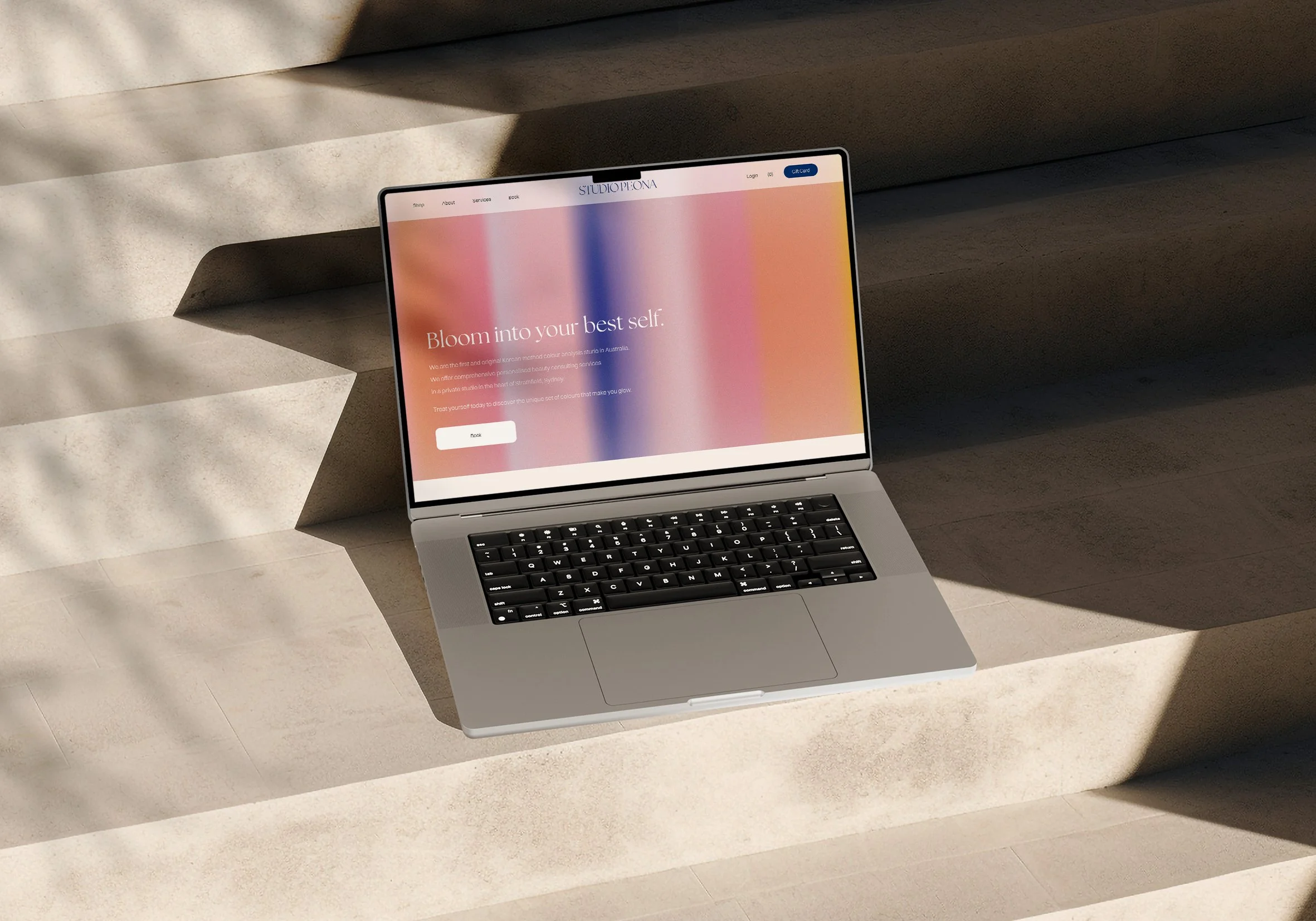
Studio Peona is a brand specializing in a Korean-originated personal colour analysis system. The website was built using Squarespace, focusing on a clean and elegant layout that reflects the brand’s identity. It includes detailed service descriptions, a built-in reservation system, and an integrated shop page for product sales.
Key Features: Service overview, e-commerce shop
Role: site structure planning, Squarespace implementation
Tools: Squarespace, custom CSS, basic JavaScript
Studio Peona는 한국형 퍼스널 컬러 분석 시스템을 기반으로 다양한 서비스를 제공하는 브랜드입니다. Squarespace 플랫폼을 활용하여 브랜드 아이덴티티를 강조하는 깔끔하고 세련된 웹사이트를 구축하였으며, 서비스 설명, 예약 시스템, 제품 판매를 위한 쇼핑 기능을 포함하고 있습니다.
Studio Peona is a brand specializing in a Korean-originated personal colour analysis system.
The website was built using Squarespace, focusing on a clean and elegant layout that reflects the brand’s identity. It includes detailed service descriptions,
a built-in reservation system, and an integrated shop page for product sales.
Key Features:
Service overview, e-commerce shop
Role: site structure planning, Squarespace implementation
Tools:
Squarespace, custom CSS,
basic JavaScript
Studio Peona는 한국형 퍼스널 컬러 분석 시스템을 기반으로 다양한 서비스를 제공하는 브랜드입니다. Squarespace 플랫폼을 활용하여 브랜드 아이덴티티를 강조하는 깔끔하고 세련된 웹사이트를 구축하였으며, 서비스 설명, 예약 시스템, 제품 판매를 위한 쇼핑 기능을 포함하고 있습니다.


Website Design + Development
Studio Peona approached us with a clear vision: to create a digital space as calm, intuitive, and thoughtful as the personal colour analysis experience they offer. The goal was to make users feel understood and supported as they explore their individual tones.
The website needed to communicate both credibility and aesthetic sensitivity. We focused on crafting a user-friendly structure that felt graceful, easy to navigate, and naturally flowed between service information, reservations, and shopping. Rather than overwhelming visitors with visuals, we used space, subtle colour cues, and delicate typography to reflect the quiet confidence of the brand.
At the heart of the project was a desire to evoke trust and calm—giving visitors a sense of clarity from the very first interaction. The result is a website that mirrors the emotional and personal nature of colour analysis, designed to feel just as thoughtful as the service itself.


